Graphic
Designer
Graphic
Designer

Concept Development, Art Direction, Graphic Design, Photo Manipulation, Mockup Production
John Green Collector's Edtions
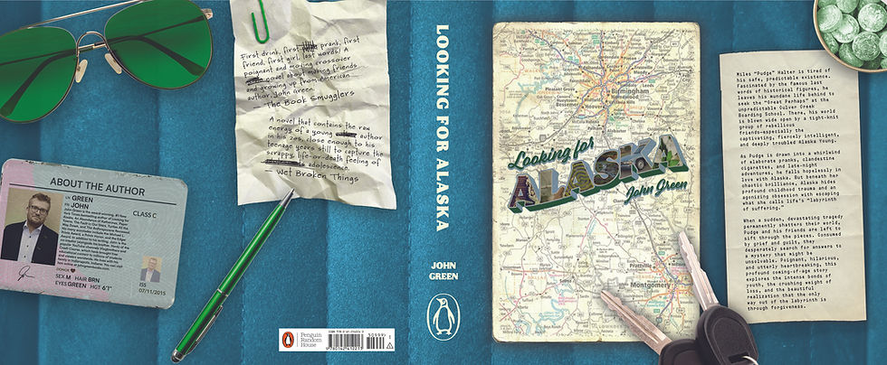
These John Green collector’s edition book jackets are not only unified under a single overarching theme, they are also unexpected and aesthetically pleasing. Young adult fiction covers frequently rely on character portraits or generic typography. The challenge was to break away from traditional publishing layouts and create a cohesive, immersive design system that uses environmental storytelling to convey the central theme connecting all three books: the power of the transformative journey.


To immediately ground the series in the classic teenage road trip motif, the jackets were designed to form a realistic flat-lay "car seat" scene. Traditional book jacket conventions were completely reimagined as tactile, in-world objects: the author biography became a driver’s license, the synopsis a candy shop receipt, and the critical reviews crumpled up notes.
The front covers act as vintage postcards, featuring customized 3D typography that embeds narrative "easter eggs" inside the lettering, layered over authentic road maps specific to each book's geographical setting. Meticulous prop styling further individualizes each title while maintaining the series' aesthetic constraint:
heart-shaped sunglasses and motifs represent the mathematical approach to love in An Abundance of Katherines, sunny colors and orange candies anchor Paper Towns in its Florida setting, and a specific electric blue and green color palette evokes the titular character in Looking for Alaska.